What Makes A Great Logo Design?
By Black Bear Design on 11/13/2014
Logo design is a singular representation of a company or brand, but even some of the most iconic logo designs have seen an evolution over time. Every day consumers are confronted with countless logos, mostly unaware of how these icons are constantly transmitting a slew of messages aimed at the subconscious. Because a logo may only have a second to tell the story, creating a good one can sometimes be the most difficult aspect of branding.
So what makes a logo great? Would you know a great logo if you saw one? How can you tell if a logo is truly effective or not? A great logo makes a company memorable. It accurately conveys the company’s identity. A great logo will be attractive but will also have a function too. A great logo is art amplified.
Elements of Great Logo Design
Distinguish your company from your competition. Don’t try to emulate another company. Be your own brand. Less than a decade after Coca-Cola was born, Pepsi quickly became successful by setting themselves apart rather than trying to emulate the leaders.
Use meaningful colors. Different colors and shades can have different effects on people because of color association. Green is associated with the environment, growth and renewal, and is perfect for companies with a go green initiative or garden centers. However, green can also be associated with sickness so would be a poor choice for stomach relief medications.
Use an appropriate typeface. You may generally gravitate to bold, exciting fonts, or feminine curvy fonts, but if you are a ballet company, you should probably avoid harsh, clunky lettering, and if you are a football team, you should probably avoid graceful, delicate lettering, even if it’s more attractive to you.
Be simple. Your logo can have some elaborate features, but it should be simple enough to make a quick statement. Avoid distracting elements such as LLC or taglines which are often too small to read. Your logo should be simple.
Be memorable. Your logo should make a statement about your company. The next time a customer needs your kind of business, he’ll choose you just because of brand recognition.
Evolution of a Brand
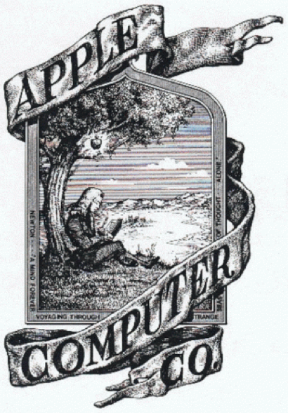
One of the most recognizable logos in the history of the modern age is the iconic Apple logo. You may not know that at the beginning of their whirlwind success was perhaps one of the most complex, convoluted and archaic logo designs you are likely to come across: a logo that represented everything the Apple brand is not.
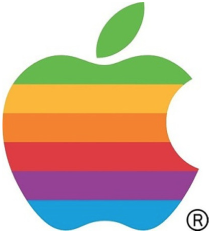
Here we have Isaac Newton sitting under the apple tree. In its defense, the 1970s was a rough timer for logo design (I’m looking at you, Starbucks and Microsoft). Fortunately, old Isaac didn’t last long at the helm of today’s technology giant, and he was replaced by the much more popular and recognizable rainbow apple.
Created by Rob Janoff, he explained the reasoning behind the design: the bite on the Apple logo was to let people know that it was an apple and not a cherry. The bite also played along with the computer buffs at that time; it had a similar sound off to the word ‘byte’, a unit of digital information in computing and telecommunication.
The rainbow effect remained intact from 1976-1998 when the new monochrome logo was launched. Aside from the cost of reproducing the multi-colored icon, one of the main reasons for developing the monochrome logo was that the new Mac computers were being manufactured with metal casing instead of plastic, and no one was a fan of the cartoonish color logo on the new sleek computer models. This logo has been active since 1998.


